Table of contents
Let’s be real—staring at forex charts without knowing what you’re looking for feels like trying to read a map in the dark. In DailyFX Forex Trading Course Walkthrough: Part Seven, we flip the switch. This guide breaks down the key technical tools traders use to spot trends, catch momentum, and make smarter entries. If you’ve ever thought, “There has to be a better way to read this chart,”—you’re in the right place.
Technical analysis isn't just some Wall Street buzzword. As John Murphy, author of Technical Analysis of the Financial Markets, puts it: “Charts are the footprints of money.” Learn to read those footprints, and you’re suddenly playing offense—not just defense.
We’ll walk you through trendlines, price levels, indicators like RSI and MACD, and even touch on Fibonacci (yes, that guy). It’s practical stuff—zero fluff, all signal. Let’s dive in.
Basics of Technical Analysis
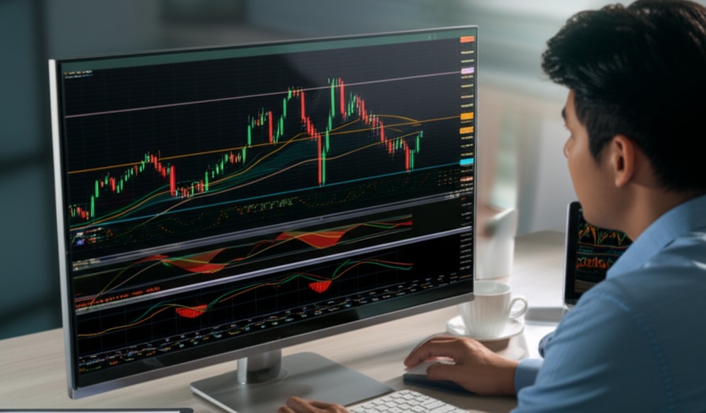
“Technical analysis is not prediction. It is a probability tool,” says Kathy Lien, Managing Director of FX Strategy at BK Asset Management. That quote stuck with me the first time I stared at a forex chart. No clue what the candlesticks meant. No understanding of why traders cared about support and resistance zones. I just saw chaos on the screen.
Then a mentor explained: technical analysis is the language of the market. Each candle tells a story. Price action is the voice of traders voting with real money. The tools—moving averages, oscillators, indicators—act like weather instruments. They do not guarantee a storm, but they tell you one might be brewing.
From veterans on DailyFX to everyday traders sharing P&L screenshots on Reddit’s r/Forex, the takeaway is the same:
Charts reveal patterns in market psychology
Support and resistance show where big players are watching
Trends matter more than headlines
Indicators confirm what price action already whispers
A properly read chart is not just a graph—it is a battlefield map. Learn it, and you stop reacting. You start positioning. That is the power of technical analysis.
Types of Price Charts
Charts aren’t just pictures—they’re language. Knowing how to read them means knowing how to trade.
How Candlestick Charts Reveal Sentiment
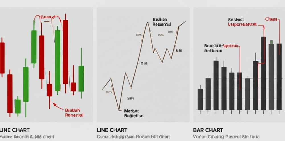
Candlestick charts are like the mood rings of the market—they reveal how traders feel. Every candle tells a story about sentiment: a long wick hints at rejection, while big bodies scream confidence. Bullish patterns (like hammers) or bearish ones (like shooting stars) are more than shapes—they’re a peek into market psychology.
Price action reflects everything known and unknown,
says Steve Nison, pioneer of candlestick charting in the West. If you want to spot trend shifts before the crowd, learn these patterns like your ABCs.
Line vs Bar Charts in Forex
Here’s a quick side-by-side to help you decide:
| Chart Type | Key Feature | Best Use Case |
|---|---|---|
| Line Chart | Shows closing prices | Clean trend snapshots |
| Bar Chart | Includes OHLC data | Detailed price tracking |
Line charts keep it simple, great for visualizing currency pairs at a glance. Bar charts dig deeper—ideal when you want to dissect open, high, low, and close prices. Both belong in your technical analysis toolkit, depending on your focus.
Choosing the Right Chart for Strategy
Not all charts fit every trading strategy. Swing traders might lean into candlestick charts with trend indicators, while scalpers prefer ultra-clean line charts for fast setups. Your timeframe matters too—a 1-minute bar chart shows chaos, a daily candlestick offers clarity.
Define your trading strategy (e.g., trend following, reversal catching).
Match it with the chart that shows what you need.
Add indicators that complement—not clutter—your view.
Bottom line? Pick a chart type that works for you, not just what’s popular on TradingView.
Trendlines and Channels
Mastering trendlines and channels gives traders a visual edge. This section walks you through how to draw, trust, and trade within the lines that define market behavior.

Drawing Trendlines That Actually Hold
Drawing a solid trendline is like finding the backbone of the market. To get one that actually holds:
Anchor it to at least two swing highs or lows.
Confirm the slope matches market momentum.
Look for multiple price touches—validation is key.
A trendline without price respect is just a guess. Stick to clean charts, avoid clutter, and draw with purpose. As the saying goes in trading rooms: “The market talks, your lines just need to listen.”
Parallel Channels to Track Price Zones
Parallel channels are trendlines’ cooler cousins—they track price movement between upper and lower boundaries.
Start by drawing a valid trendline on the price slope.
Clone it and drag across to create a parallel boundary.
Watch for price bouncing within the channel—those are your zones.
| Trend | Upper Bound | Lower Bound |
|---|---|---|
| Uptrend | Resistance at 1.1023 | Support at 1.0950 |
| Downtrend | Resistance at 0.9870 | Support at 0.9785 |
Common Mistakes When Drawing Trends
Traders often mess up trendlines by trying too hard. Here are three classic errors:
Chasing the price instead of letting it confirm.
Ignoring failed retests—a trendline should act like support or resistance.
Slapping a line anywhere without anchoring to real swing points.
Take your time. “If it looks forced, it probably is,” says Linda Raschke, veteran trader.
Breakout vs Bounce in a Channel
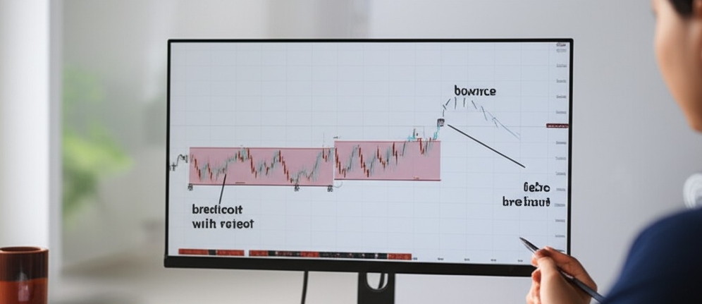
Knowing when a channel breaks or holds can make or break a trade. Here's how to tell:
Bounce: Price hits the boundary and flips back. Great for range plays.
Breakout: Price punches through with volume and a retest—go with it.
False Breakout: Quick spike, no follow-through—stay out!
Confirmation is king. No need to rush. Let the price action prove it before you commit your capital.
Support and Resistance Zones
Support and resistance zones are like road signs on your price chart—miss them, and you're flying blind. Mastering these levels turns hesitation into confident action.
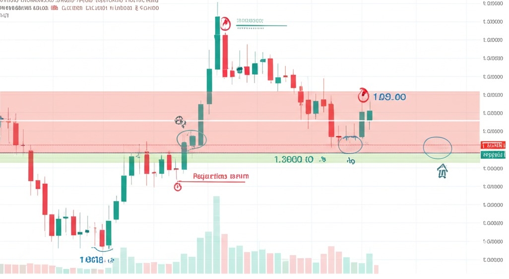
Identifying Psychological Price Levels
You ever notice how prices love hanging around clean numbers like 1.3000 or 100.00? That’s no accident. These psychological levels act like magnets for price action. They’re driven by trading psychology—round numbers feel "safe" to traders, and that creates natural support or resistance levels.
Round numbers: Often turn into key levels (think 1.000, 50.000)
Repeated rejection points: When price keeps bouncing off a level
Clusters with volume spikes: Show significant price points with trader attention
These levels reflect investor sentiment, especially when paired with chart patterns like double tops or bottoms.
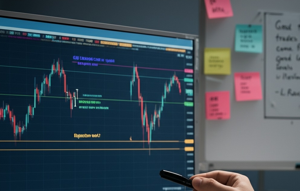
Using SR Zones for Entry Timing
Trading without using SR zones is like stepping into traffic without looking both ways. Timing entries around these zones can seriously boost your win rate.
Wait for confirmation: Don’t guess—watch price react at an SR level before jumping in.
Use candle clues: A strong bullish engulfing pattern at a support zone = potential buy signal.
Watch for rejection wicks: At resistance zones, long upper wicks often scream “reversal incoming.”
Tip: Combine SR analysis with market structure and price action for better setups.
As veteran trader Linda Raschke says, “Good trades come from good levels. Period.”
Which Moving Average Works Best
Choosing the right moving average can mean the difference between catching a clean breakout or chasing fake-outs. Let’s break down what works—and what messes traders up.
SMA vs EMA in Fast Markets
In fast-moving markets, the SMA often lags behind, missing critical signals. The EMA, with its faster response to price shifts, is generally favored by active traders.
SMA = smoother, better for long-term trends
EMA = quicker, ideal for scalping or news-driven trades
“EMAs react more like a racecar; SMAs are your steady old pickup,” says trading coach Linda Raschke.
Use case: When volatility spikes, EMAs help you stay nimble.
Short-Term MAs for Scalping
Scalping is like speed dating for trades—you’re in, you’re out, and no time for second-guessing. Short-Term Moving Averages (like 5- and 9-period EMAs) help spot micro-trends and lightning-fast setups.
Great for entry confirmation on breakouts
Helps filter market noise during intraday chaos
Best paired with tight stop-losses and quick exits
It’s a dance between quick signals and fast fingers. High-frequency traders love 'em because they're all about fast execution and tiny price movements.
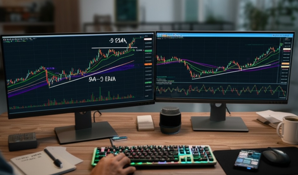
Using 50/200 Crossovers Smartly
The 50-day/200-day Moving Average Crossover is like the “blue check” of trend signals—legit and widely followed. But timing is everything:
Golden Cross: 50 MA crosses above 200 → bullish signal
Death Cross: 50 MA crosses below 200 → bearish alert
| Market Type | Avg. Price Change (30 Days) | Signal Strength |
|---|---|---|
| Bull Market | +4.75% | Strong |
| Bear Market | -3.10% | Moderate |
| Sideways | ±1.25% | Weak |
Smart traders don’t trade just the cross—they wait for volume confirmation or support retests to avoid being faked out.
Common Pitfalls in MA Strategies
Let’s face it, not all Moving Average Strategies are created equal—and many traders trip on the same old wires:
Over-relying on a single MA leads to false signals
Whipsaws kill gains in sideways markets
Ignoring risk management is a strategy killer
Many forget: MAs are lagging indicators
No confirmation? You’re trading on hope
Avoid being that guy who adds 10 MAs on a chart and hopes for clarity. Keep it sharp, and filter with context.
Combining MAs With Price Action
This is where the magic happens. Pairing Moving Averages with Price Action allows for more realistic and confident trades.
Use MAs to define market structure (bullish/bearish)
Spot candlestick reversals near MAs
Confirm setups with support/resistance levels
Example: A bullish engulfing candle bouncing off the 20 EMA with prior S&R support? That’s a green light with context and confirmation—not just blind indicator-following.
Great traders don’t just watch lines—they watch how price behaves around them.
RSI vs Stochastic: What’s More Reliable
Some tools tell you what’s up, others whisper what’s next. In this cluster, we unpack two of forex’s most-used indicators—RSI and Stochastic—and how smart traders blend them.
RSI Overbought Signals and Limits
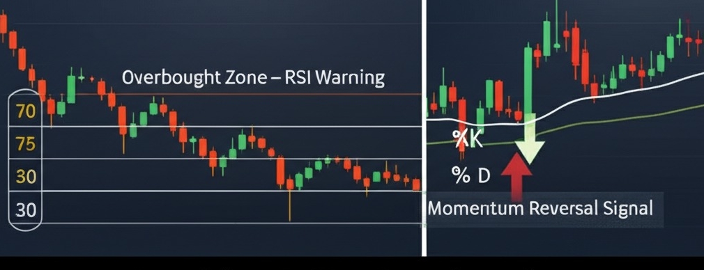
The Relative Strength Index (RSI) shines when it comes to identifying overbought or oversold market conditions. A reading above 70 often screams “Yo, the price might cool off soon,” while below 30 can hint at a possible bounce.
Traders often use the 70/30 thresholds as signals.
In strong trends, RSI may stay overbought/oversold longer—don't panic.
It’s best when used with price action to confirm timing.
“RSI is a great warning light—but not a brake pedal.” — Kathy Lien, currency strategist
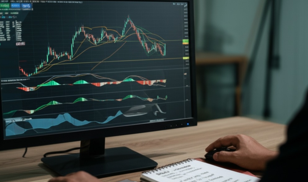
Stochastic for Range-Bound Setups
This oscillator thrives in sideways or range-bound markets. The magic lies in the interaction of the K-line and D-line—when these lines cross near 80 or 20, it can suggest momentum reversals.
Overbought: above 80
Oversold: below 20
Crossovers in these zones = heads up
Traders use Stochastic for fast setups and scalping inside tight ranges. It's more “reactive” than RSI—great when price isn't trending.
Why Traders Combine Both Indicators
Smart traders often combine RSI and Stochastic for confirmation. Why? Because they complement each other—RSI tracks strength, Stochastic reacts to momentum shifts.
RSI gives a macro sense of price exhaustion.
Stochastic nails entry timing within that setup.
When both flash similar signals? That’s your green light.
| Indicator | Signal | Market Action |
|---|---|---|
| RSI | Overbought 75 | Watch for reversal |
| Stochastic | K/D crossover | Entry short |
When both line up, it’s not just noise—it’s a plan.
How Does MACD Signal Momentum
"I used to stare at charts, thinking the MACD was just another flashy line—until I watched it call a reversal before my stop-loss did,” says Brandon LeClair, a currency analyst with over a decade of live trading experience. His sentiment is echoed across forums and classrooms. When used correctly, the MACD (Moving Average Convergence Divergence) is more than a technical indicator—it is a momentum detector trusted by professionals.
What makes MACD stand out is its dual structure: the signal line and the histogram. These two elements track the distance between moving averages and translate that into momentum. Think of the signal line as the navigator—it tells you when the crossovers occur. When the MACD line crosses above the signal line, it usually hints that momentum is turning bullish. If it dips below, it might mean selling pressure is gaining traction.
The histogram, on the other hand, visually amplifies the difference between the two lines. A widening histogram often aligns with a growing trend, while flattening bars may show a slowdown or divergence.
In daily trading strategy? The MACD helps identify:
Reversals early in a trend
Overextensions in volatile markets
Confirmations alongside RSI or Fibonacci
Endorsed in John Murphy’s Technical Analysis of the Financial Markets, MACD is seen as a backbone for momentum-based trading. Its ability to combine trend strength, momentum, and timing makes it essential for serious traders.
When to Use Fibonacci Levels
Fibonacci levels are like your GPS in the forex jungle. They help map out when to enter a trade and where to lock in those sweet profits.
Entry Points with Fibonacci Retracement
Fibonacci retracement is your go-to tool when price takes a breather mid-trend. It helps you spot entry points as the market pulls back to key support levels.
Watch for price action around 38.2%, 50%, and 61.8% zones—these act like invisible magnets.
Pair retracement levels with chart patterns (like flags or wedges) for extra confirmation.
Use them to identify buy signals when the trend resumes upward, or sell signals in a downtrend.
“Fibonacci retracement is not prediction—it’s preparation,” says Kathy Lien, managing director of FX Strategy at BK Asset Management.
Targeting Exits Using Extension Levels
Sometimes the hardest part of a trade? Knowing when to walk away with your wins. That’s where Fibonacci extension levels shine.
Find your swing low to swing high (or reverse for downtrend).
Project price targets using common extension ratios: 127.2%, 161.8%, and 261.8%.
Use these zones to plan take-profit points and set realistic stop-loss thresholds.
| Extension Level | Common Use Case | Probability of Reversal |
|---|---|---|
| 127.2% | Short-term trades | Medium |
| 161.8% | Primary target | High |
| 261.8% | Trend exhaustion | Very High |
This combo of technical analysis and smart risk management helps you stay disciplined—even when the chart looks tempting to chase.
Conclusion
You've now got the tools to read charts like a roadmap, not a riddle. From spotting trends to catching momentum, this part of the journey packed some serious trading firepower.
“Price moves because of people. Charts show what people do,” as veteran trader Linda Raschke once said. Let that sink in.
Keep showing up. Open a demo chart, try drawing zones, test your indicators. The next part brings it all together—strategy meets execution.
A moving average smooths out price data to help you spot the direction a currency pair is trending. It’s like clearing the noise from a crowd so you can hear the music. Traders use it to:
Confirm trends
Identify entry/exit zones
Avoid emotional decisions
Spot reversals with crossovers
Imagine support like a floor—the price hits it and tends to bounce up. Resistance? That’s your ceiling. It blocks the price from breaking higher. It’s not magic—it’s psychology, repeated behavior, and a bit of math.
RSI (Relative Strength Index) measures how “overbought” or “oversold” a currency is. If it’s too high, buyers might be losing steam. Too low? Sellers could be fading. It’s a great early warning system—but don’t fly blind with it. Use it with trendlines and price action.
SMA (Simple Moving Average): Equal weight to all prices
EMA (Exponential Moving Average): More weight on recent prices
SMA = smoother, slower
EMA = faster, reacts quicker to price changes
Fibonacci levels help traders predict where price might pull back before continuing its move. It’s like knowing where potholes might show up on a road—you don’t swerve for every one, but you’re glad you saw it coming.
MACD can look like a science experiment, but at its core, it’s just comparing two moving averages and watching when they cross. Add in the histogram, and you’ve got a solid read on momentum shifts. Stick with it—it clicks faster than you think.
Start with candlestick charts. They show emotion and momentum better than the others. Once you learn to read them, it’s like learning a new language—but one that tells you when traders are freaking out or piling in.
Short answer? No. Long answer? Also no. Think of indicators like instruments in a band—they sound okay solo, but you need the whole band to play a great tune. Combine tools for confirmation.
They matter. A good trendline shows you the heartbeat of a market move. If price respects that line again and again, that’s not luck—it’s pattern, and pattern is power in trading.


