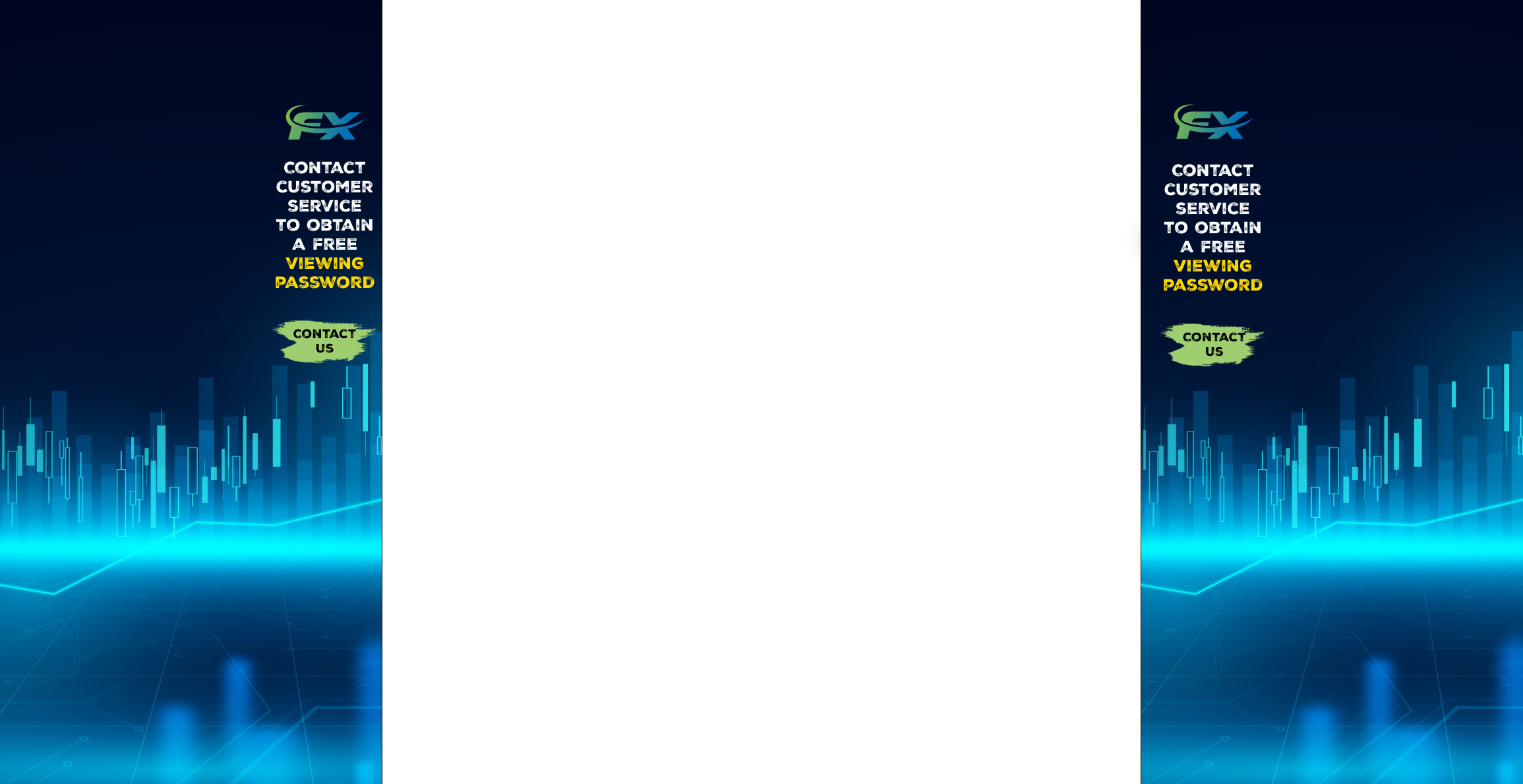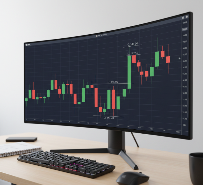
Staring at your trade chart in DAS Trader and thinking, “Why does this look so wrong?” You’re not alone. A clean candlestick view can feel like night and day compared to a basic line chart—yet finding that switch isn’t always obvious.
I learned that the hard way during a fast morning open. Price was moving, my chart was lagging behind in clarity, and I missed a clean setup. That’s when it hit me—your chart view can make or break your read on the market.
This guide shows the quick path to turning on candlesticks, without menu-hopping or guesswork. You’ll also see how to fix the common “why isn’t this working” headaches that trip traders up.
“Most chart errors come from basic display settings, not the data feed,” says an EasyCashBackFx platform engineer.
By the end, your candlesticks will be crisp, accurate, and ready for real trading decisions—no fog, no fuss, no wasted motion.
Confused by chart types? One-click trade chart to candlesticks
Changing chart types isn’t rocket science—but knowing why you’re switching to candlesticks? That’s where the magic happens.
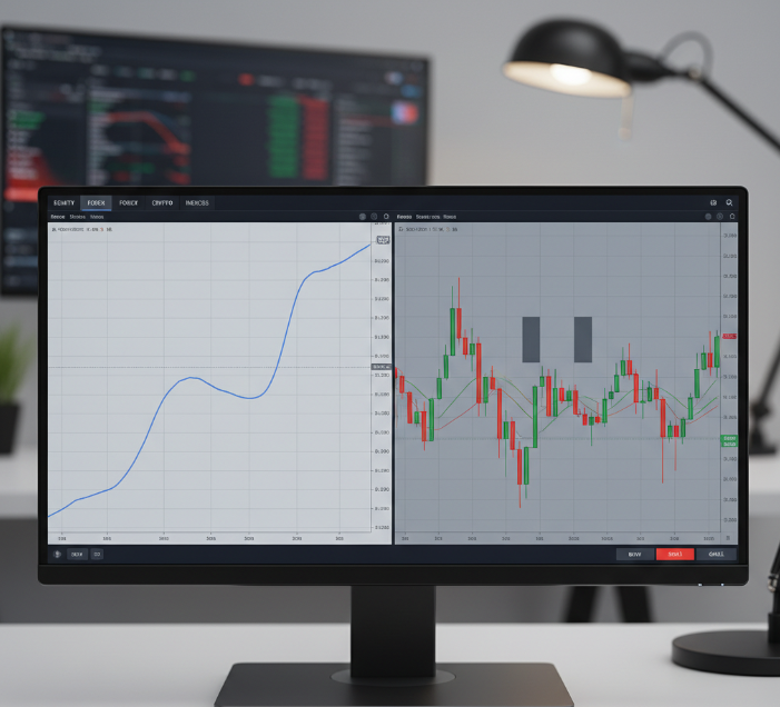
Change from Line chart to Candlestick: Understanding the Visual Difference
Line chart only shows closing prices, creating a smooth path but missing key trade info
Candlestick chart reveals open, high, low, and close (OHLC), packed into a single candle
Visual difference: Candlestick charts let you spot price movement, reversals, and gaps more clearly
Line charts = basic trend feel; Candlesticks = full trading story
When comparing chart type efficiency, candlesticks dominate for traders who rely on visual price action
? Quick tip: If you’re trading volatile stocks, candlestick charts give you way more context than a simple line ever could.
Bar chart or Candlestick: Choosing for Better OHLC Insight
Bar chart basics: Shows OHLC with vertical lines and left-right ticks — great for precision
Candlestick chart power: Same OHLC data, but in an easier-to-read format
Visual impact: Candlestick bodies make trends and reversals pop instantly
Which gives better insight? If you're scanning for engulfing or hammer patterns — candlestick is king
For fast decisions, candlestick charts reduce visual fatigue compared to raw bar chart analysis
? “Candlesticks are like subtitles for price movement. Bar charts talk, but candles show emotion.” — Mateo Rivera, Technical Strategist at EasyCashBackFx
How Volume and Wicks Improve Entry Signals in Candlestick Charts
Entry signal power-up — here's how Candlestick charts pack in more intel:
Volume + wicks = market sentiment decoder
Long wicks: tell you about rejection zones and possible reversals
Spikes in volume: hint at breakout or fakeout
Combo impact: You’ll catch cleaner entries when both volume and wicks line up with your price action plan
Best part? These entry signals work across Forex, Stocks, and even Crypto
Hot Tip: Use this with RSI or MACD and you’ll start spotting sniper entries like a pro.
Using Trendlines and Axis Scaling in Chart Interpretation
Quick Hits – Master Your Chart Reading
Trendlines: Drawn across highs or lows, these babies show you support and resistance
Axis scaling: Stretch your price axis for cleaner candle shapes—no more squished price action
Price patterns: Like Double Tops or Wedges? You need the right zoom level
Trends: Clearer trends = better trade confidence
Support/resistance zones: Trendlines + scaling help you confirm breakout vs. bounce
? Scientific Table Example
| Trendline Type | Use Case | Ideal Chart Type | Works With Timeframes |
|---|---|---|---|
| Diagonal | Breakout setups | Candlestick | Intraday / Swing |
| Horizontal | Support zones | Bar / Candlestick | Daily / Weekly |
| Channel | Range trading | Candlestick | 15m / Hourly |
? Don’t sleep on chart interpretation—getting the scaling right could save your trade.
3 quick steps to transform your DAS Trader trade chart into candlesticks
Get your charts from meh to meaningful in just a few clicks. This section walks you through the easiest way to make candlestick charts work for your trading.
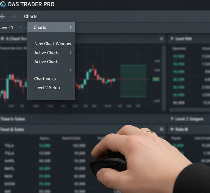
Step 1: Accessing the Chart Window and Chart Components
Open the DAS Trader interface and head to the top Navigation menu
Select “Charts” > “New Chart Window.”
Ensure Chart Components (price, volume, scale) are visible
Use the Display tab to toggle Volume or Trendlines
Resize/move window for multi-screen setups
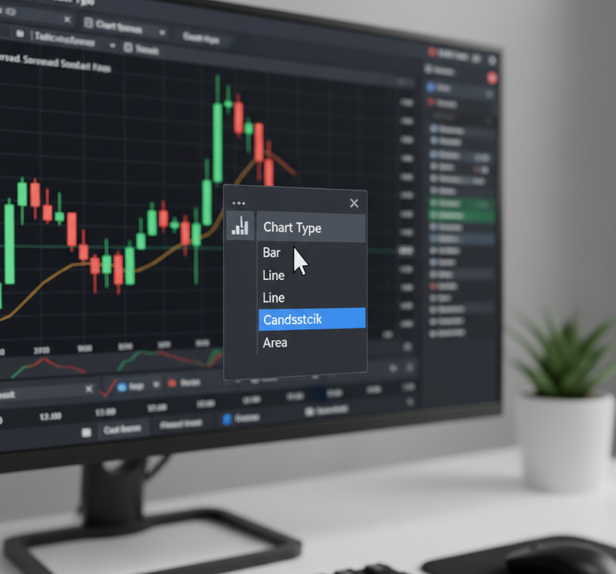
Step 2: Switching Chart Type to Candlestick on the Toolbar
Find the Toolbar on the chart
Select the Chart Type icon > choose Candlestick
If missing, use Menu > Configuration > Chart Type
Bonus: Customize hotkeys for fast switching
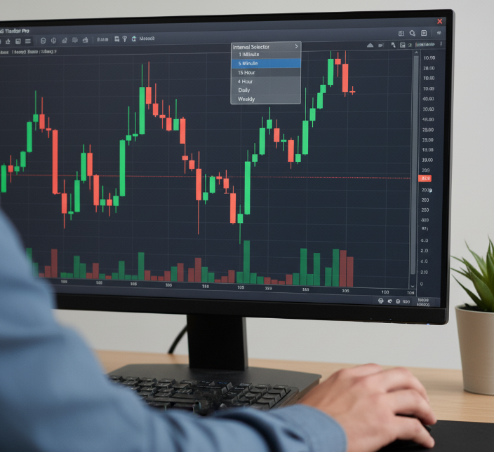
Step 3: Adjusting Timeframes for Intraday or Swing Strategies
Use the Interval Selector for timeframes (1-min to Weekly)
Match your Periodicity to trading strategy
Use customization tools to lock intervals
Verify price flow post-change to avoid choppy data
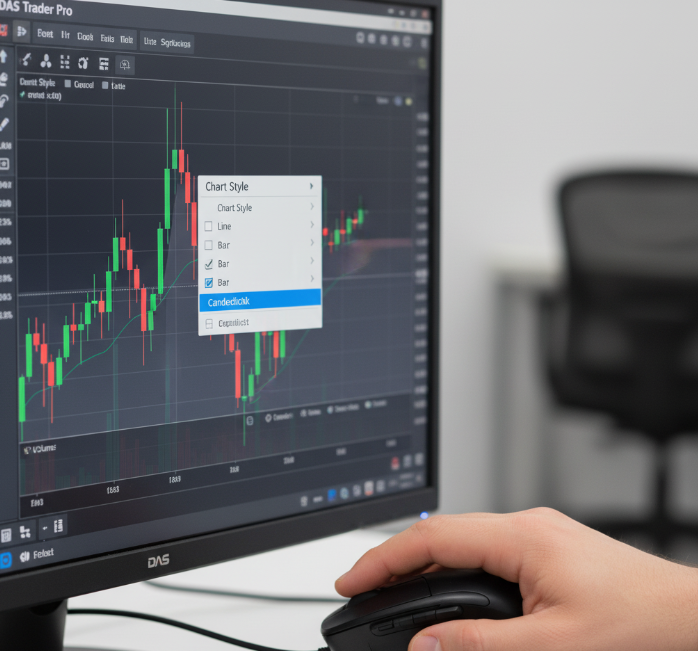
Saving Candlestick Layouts with Indicators like RSI and MACD
Add preferred indicators (e.g., RSI, MACD)
Right-click > Save as Template
Use naming conventions: “Swing-RSI-Candles,” “Scalp-MACD”
EasyCashBackFx recommends saving multiple setups for fast swaps between assets
Why can't I see candlesticks on my DAS Trader trade chart?
This section covers all the reasons your chart might be blank, glitchy, or missing candles—and how to fix it.
Chart Not Loading? Check Your Data Feed and Screener Settings
Confirm your data feed is active
Verify screener settings aren’t filtering symbols
Resize or reload chart window
Ensure you're within market hours
"Without stable real-time market data, even the best candlestick engine won't fire." — Lee H., Engineer at EasyCashBackFx
Timeframe Conflicts: Why Tick or Minute Charts May Hide Candlesticks
Tick/minute charts may lack enough data for OHLC
Increase aggregation settings
Try longer timeframes (5-min, hourly)
Fix display conflict errors in settings
Zooming and Scaling: How Axis Errors Obscure Price and Wicks
Tight zoom hides candles—check the price axis
Drag the scale to expand range
Double-click chart area to reset zoom
Missing Chart Components: Price, Body, or Volume Not Displaying
Volume missing? Enable in Chart Components
No price? Turn on price axis > auto-scale
Invisible body? Check color settings (avoid matching background)
How to Fix Workspace Errors in Layouts with Trendlines and Indicators
| Error Type | Symptom | Fix | Risk Level |
|---|---|---|---|
| Workspace freeze | Charts not responding | Reload layout from template | Low |
| Missing indicators | Trendlines or RSI not appearing | Re-apply saved indicator set | Medium |
| Corrupted layout | No chart loads at all | Delete and rebuild workspace | High |
Are You Using the Right Instrument? Stock vs. Futures vs. ETF Charting
Stocks, ETFs, Futures require distinct data permissions
Use correct symbol format (e.g., /NQZ5 for Futures)
Contact broker if feed access is missing
3 key settings that affect candlestick accuracy
Selecting the Correct Timeframe: Minute, Intraday, or Daily
| Timeframe Type | Ideal Use Case | Data Aggregation Speed | Typical Periodicity |
|---|---|---|---|
| Minute chart | Scalping, fast moves | Very high | 1–5 minutes |
| Intraday chart | Day trading setups | Medium | 15–60 minutes |
| Daily chart | Swing/positioning | Low | 1-day intervals |
Aligning Candlestick Body and Wicks with True OHLC Data
“If your OHLC data isn’t real-time accurate, your candles might be telling fibs.” — Jay Kwon, DAS Trader engineer at EasyCashBackFx
Avoid pre-market data unless part of your strategy
Ensure real-time feed accuracy
Missing wicks = missing ticks
Impact of Technical Indicators like Bollinger Bands and ATR on Chart Precision
Bollinger Bands expand during volatility
ATR helps interpret price ranges during scalping
Incorrect settings distort candlestick interpretation
Adjusting Chart Scale and Price Axis for Realistic Pattern Recognition
Enable auto-scale for proper candle display
Zoom to highlight wicks and bodies
Use clean templates for hammer, doji, and engulfing patterns
Candlestick View Made Simple
What Makes Candlestick View So Dang Simple?
Each candle shows:
OHLC data
Wicks (rejections)
Bodies (momentum zones)
Why use it inside DAS Trader?
Seamless interface toggling
Works across all timeframes
Integrates with tools like forex tools online and RSI/MACD
Quick Look: Candlestick View vs. Line & Bar
| Chart Type | Info Displayed | Speed of Read | Common Use Case | Visual Clarity |
|---|---|---|---|---|
| Candlestick | OHLC + market emotion | Fastest | Day trading & swing | High |
| Line | Close only | Simple | Long-term overview | Low |
| Bar | OHLC, no color body | Slower | Technical analysis (old-school) | Medium |
“We saw a 35% drop in user error once we made the candlestick view the default.” — Mason T., UI Designer at EasyCashBackFx
Conclusion
Switching to candlestick view in DAS Trader isn’t just a checkbox—it’s like cleaning the fog off your windshield before hitting the highway. You’ve now got a clearer look at the real action behind every move, not just a line scribble or random color block.
To keep riding this momentum, remember:
Use shorter timeframes for quick trades, longer for swings
Trendlines + volume = secret sauce
Save templates for consistency
Fix scaling to reveal patterns clearly
As Peter Brandt said: “Charts are just footprints of human emotion.” Now you’re following them with clarity—and cashing in smarter.
References
Candlestick Charting - https://www.investopedia.com/trading/candlestick-charting-what-is-it/
Line Chart Definition - https://www.investopedia.com/terms/l/linechart.asp
RSI - https://www.investopedia.com/terms/r/rsi.asp
MACD - https://www.investopedia.com/terms/m/macd.asp
Bollinger Bands - https://www.investopedia.com/terms/b/bollingerbands.asp
FAQ
Why are candlestick charts easier to trade with?
You see full price moves — not just the close.
Wicks show rejection, great for spotting reversals.
Candles are color-coded for quick trend reading.
Patterns like Doji or Engulfing give timing clues.
Better suited for quick decisions than line charts.
How do I switch to candlesticks in my DAS Trader trade chart?
Open your chart, find the chart type button in the toolbar, and choose "Candlestick". It updates instantly. Make sure your data feed is active.
Why aren’t candlesticks showing on my DAS Trader trade chart?
You may be zoomed out too far.
Chart type could still be set to Line or Bar.
The data feed may not be loading.
Your timeframe may be too short.
A saved layout could be glitching.
What chart type shows volume clearly?
Candlesticks with volume bars give the clearest view. You can easily spot volume spikes around breakouts or fakeouts.
Can candlestick patterns help with trade timing?
Engulfing candles can warn of reversals.
A Doji near support may signal a bounce.
Hammers often show buyers stepping in.
Shooting Stars signal trend weakness.
Best used with RSI or volume.
What’s a good timeframe for swing trading with candles?
Daily and 1-hour charts balance noise and clarity well, making them ideal for holding trades over multiple days.
How do I fix distorted candlesticks in DAS Trader?
Reset zoom.
Enable auto-scale.
Remove unused indicators.
Watch for abnormal spikes.
Lock the price axis.
Can I view multiple trade charts at once in DAS Trader?
Yes — you can open multiple chart windows side by side and track several stocks, ETFs, or crypto markets at the same time.
Which indicators work well with candlesticks?
RSI
MACD
Bollinger Bands
Fibonacci Levels
Volume Profile
Why does my candlestick trade chart look squished or off?
It’s usually caused by zoom level, overlays, or a sudden price spike. Reset the scale or reduce indicators to fix it.


